Blog
Interior Architecture as Design Springboard
Historical restoration inspires me to look beyond the obvious and into the less visible details. More often than not these elements influence the interior design. The Arthur Astor Carey House (see previous article, First Colonial Revival Home in America) is a Colonial Revival home on Fayerweather Street in Cambridge and an exceptional example.
Soon after graduating from Harvard, Carey (1857–1923) built a home for his future family in 1881. Throughout are references embracing male and female characteristics. Given the future Carey planned, it is ironic that he and his brother alone lived there for a couple years.
Born & raised in Rome, Carey was no stranger to mythology. The bracketed overhang above the entrance is supported by the gods Janus & Vesta protecting the threshold. Janus is the guardian of exits and entrances and also represents beginnings. In fact he protects most of the gates surrounding Rome. Vesta is the goddess of the hearth of man, her fire inextinguishable. And even though she is a virgin goddess, at the same time Vesta is considered the mother of Rome: she is thought to be indispensable to the existence and survival of community.
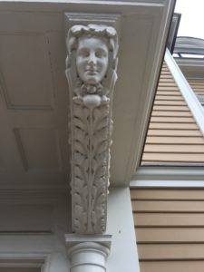

There is a reciprocal link between the gods of beginning, unending motion, who bestow life to this world as well as presiding over its end, and the goddess of the hearth of man, which symbolizes through fire, the presence of life.
Carey took his vision to a new level, building rooms revolving around the male/female interaction. Here is a timeless example of a bachelor building a home without involving their partner.
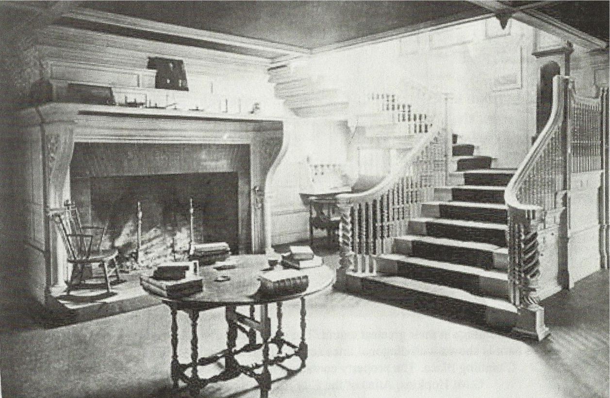
The impressive hearth on the other side of the front entrance reinforces this interpretation. Stay tuned for more posts on this grand home!
First Colonial Revival Home in America
In another first for Heidi Pribell Interiors, I’ve returned to the Arthur Astor Carey House, 28 Fayerweather Street in Cambridge, having worked with Governor William Weld’s family to prepare the home for sale in 2012. The new owners have asked me to restore and update the premises in this total gut renovation of America’s first Colonial Revival home, a landmark property on Reservoir Hill.
Harvard Classmates
The original design of the home draws inspiration from John Hancock’s home. The residence was commissioned by John Jacob Astor’s grandson Arthur Astor Carey, through former classmate Richard Clipson Sturgess of the architectural firm Sturgiss & Brigham. It represents the earliest expression of the Colonial Revival movement, a milestone for Cambridge and the country.
Early Preservation Effort
As we embark on this process of restoration, I am drawn to the early measured drawings of John Hancock’s 1737 home. Architect John Hubbard Sturgiss recorded the Hancock home in full architectural detailing before it was demolished in 1863. His measured drawings were the first of their kind in this country. Through our own process of discovery and documentation, I will draw guidance for the design process.
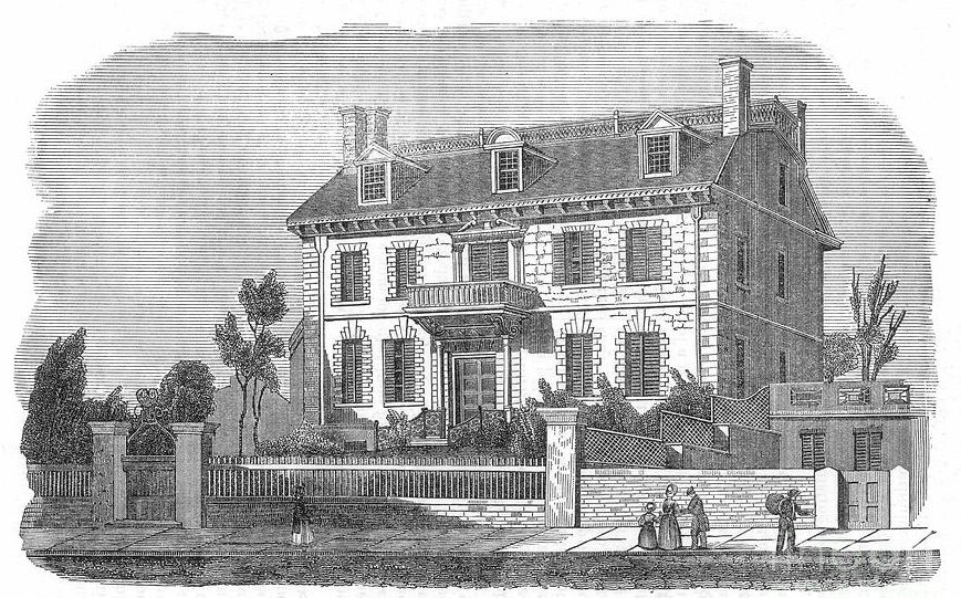 John Hancock Exterior
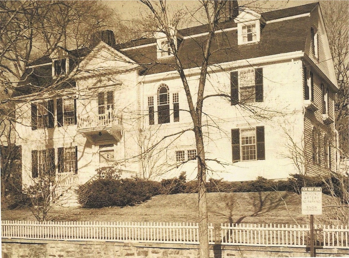

Exterior of Fayerweather Street
Behind the Scenes: Art & Music at Harvard
Ancient Pigments
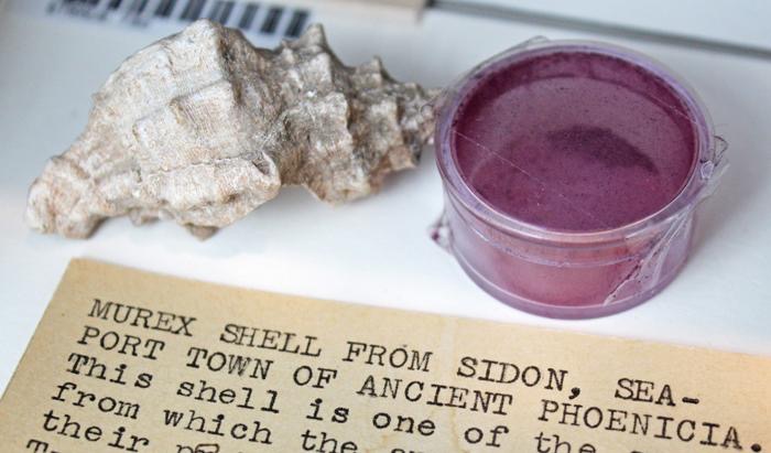
Thursday after work I was in the conservation labs of the Harvard Art Museum. The director, Narayan Khandekar, was discussing the Forbes legendary collection of pigment examples used throughout history.
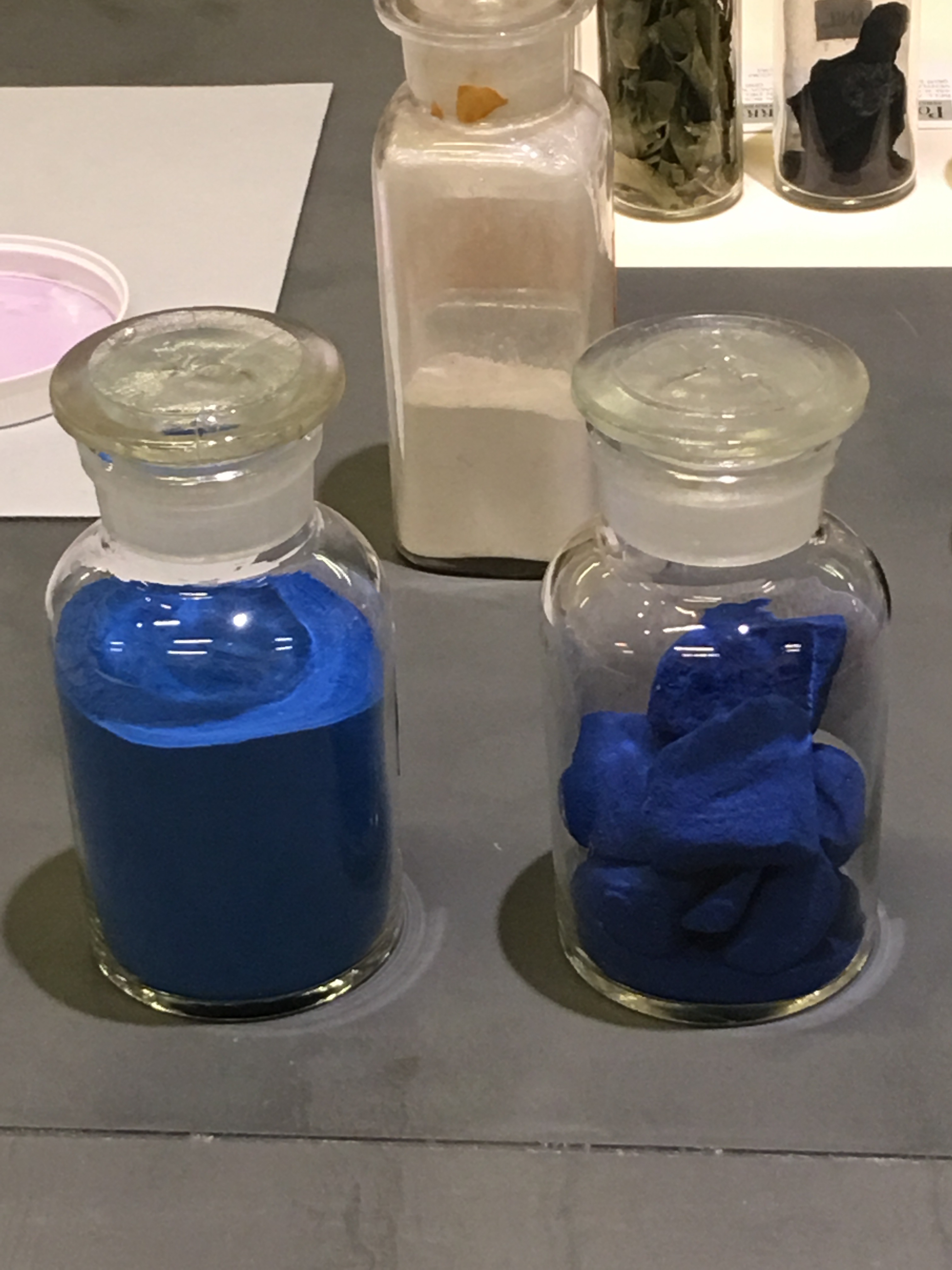
Essentially a chemist who loves art, Narayan devotes large amounts of time to scientifically analyzing pigments. He compares his work to that of a detective, or forensic scientist. Although this collection comprises nearly every pigment used through to prehistoric times, somehow there wasn’t any indigo blue.
These new indigo samples are glorious, though soon after they were acquired a small stash was found in a storage box.
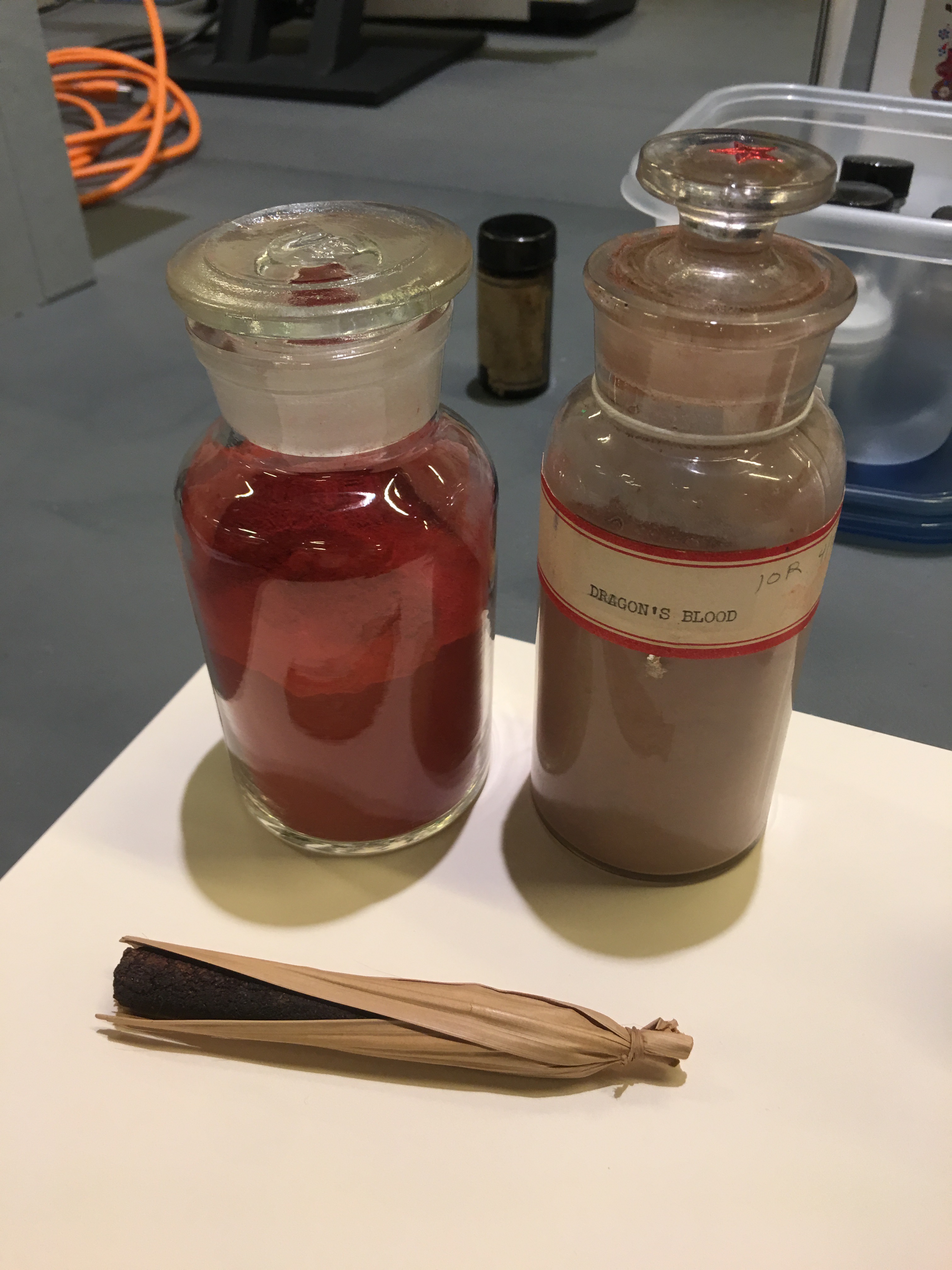
Dragon’s Blood
Despite the name Dragon’s Blood Red, the color does not come from a dragon. Sap collected from rattan palms form the derivative substance that creates Dragon’s Blood. A gorgeous red, this organic color fades readily as can be seen with the older brown sample next a fresh jar of color.
Plant specimens used for dying fabrics are also contained in jars. Some were gathered by a weaver who makes his own dyes. Although foraging plants to dye yarn seems difficult enough before weaving, before that, the dyer/weaver has first to gather, clean & spin the wool. It’s complicated!
Modern Pigments
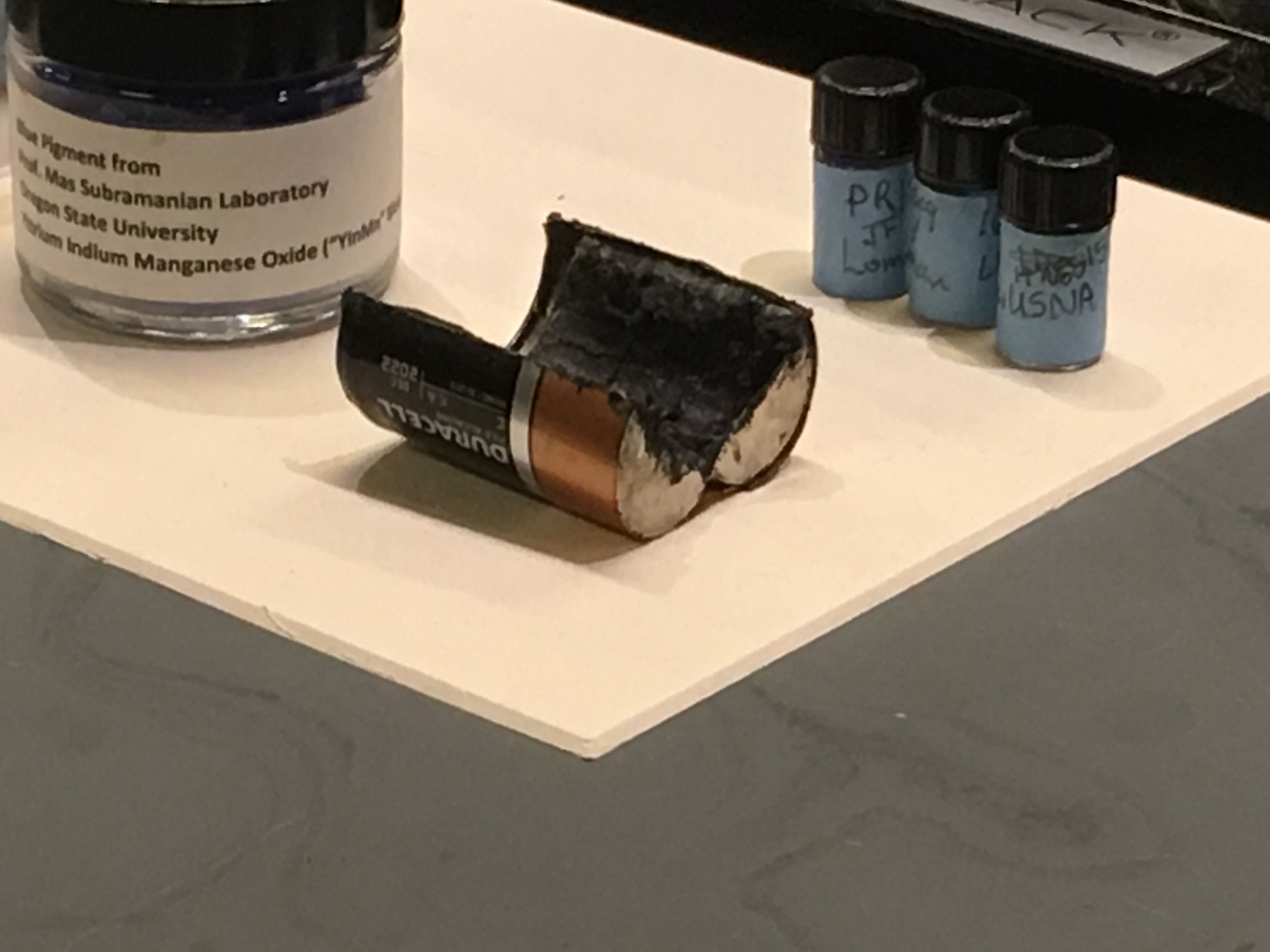
Narayan has been rebuilding the collection to also include modern pigments so as to better analyze modern & contemporary art. Analyzing new pigments is important. With this information an early Jackson Pollack proved to be a fake when it was discovered the red had been invented in the 1970’s. And nowadays artists use anything they can think of,…bits of plastic, ceramics, insects, food, and any material you can think of! He mentions that in preparation for a show last year he discovered that aboriginal artists incorporate a variety of blacks, including one found inside used batteries.
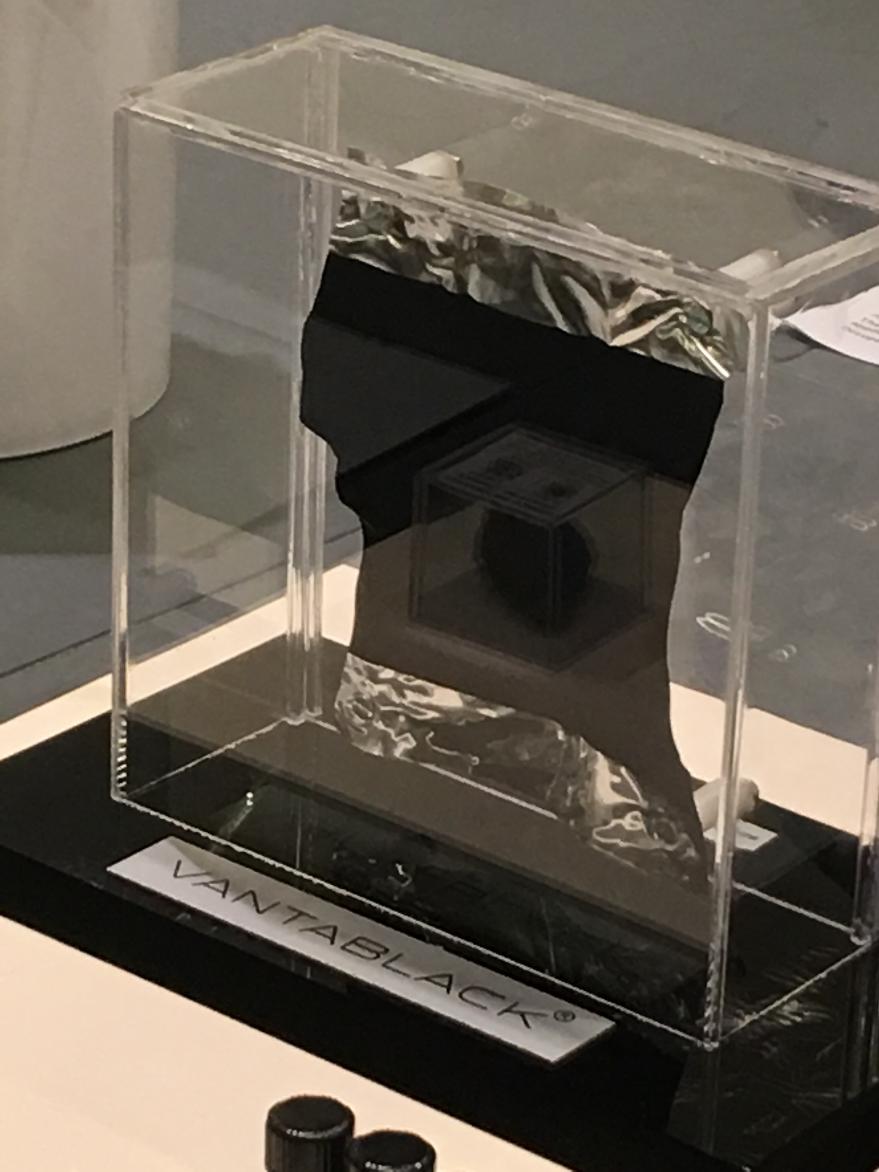
New Black
An extraordinary new black mineral pigment has been invented. Vantablack absorbs 99.965% of light and is the blackest black in existence! Oddly it cannot be used as artist pigment for anyone but artist Anish Kapoor, who holds an exclusive license from the manufacturer. This infuriates many artists, nonetheless the substance was invented for technological applications and used in aerospace & for defense. This photograph shows it grown on scrunched up aluminum foil. The Vantablack substance absorbs so much light that the wrinkled foil on which it sits, looks like flat black!
Mel Bochner
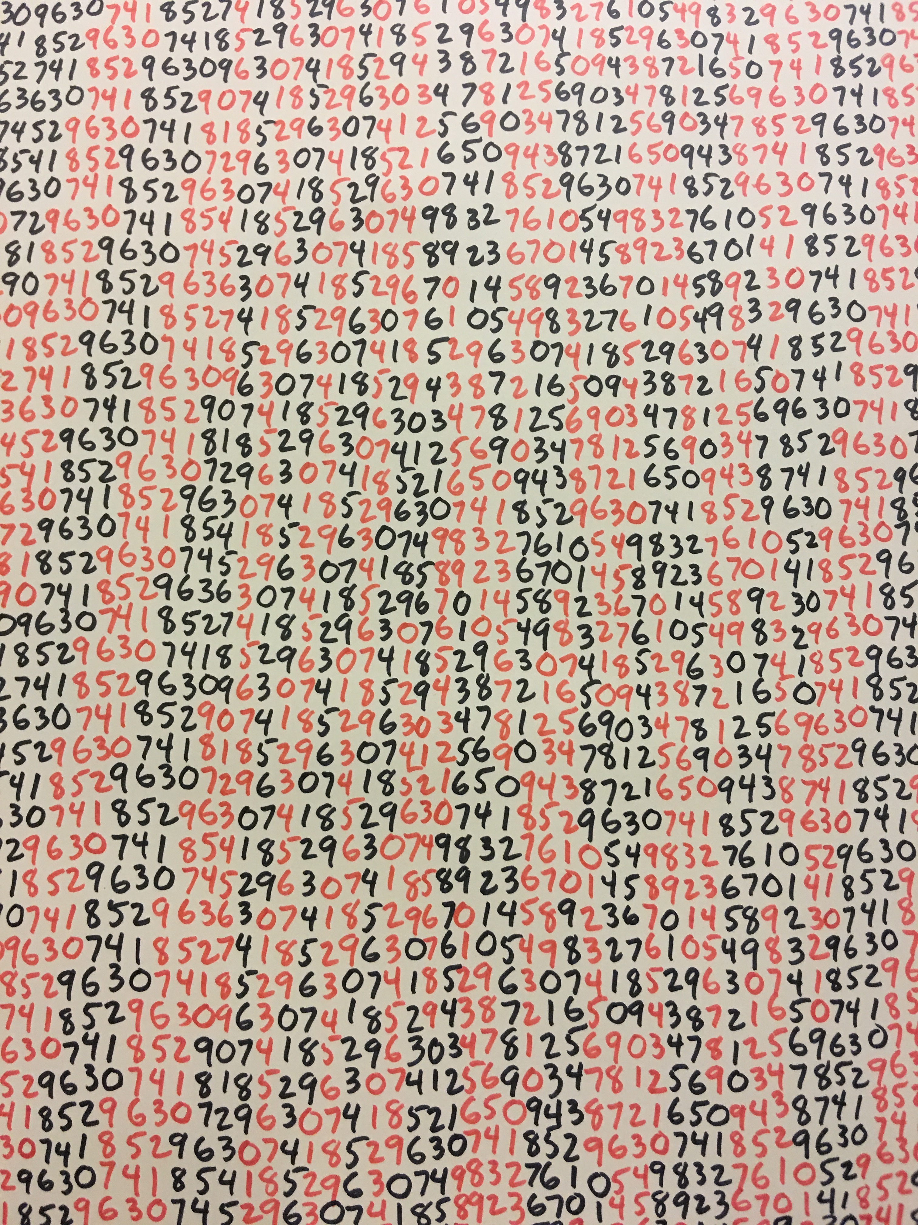
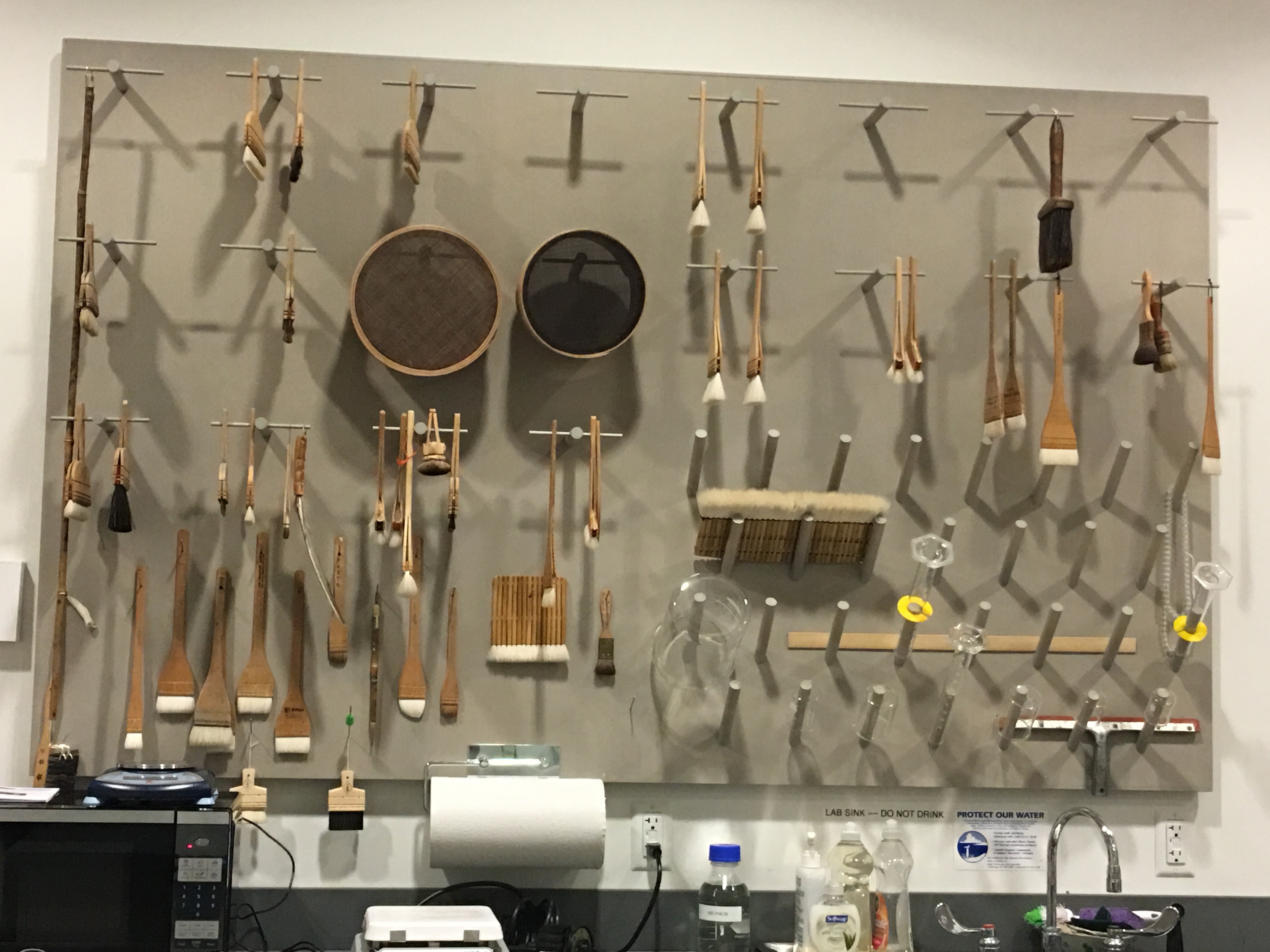
Next we examined the work of Mel Bochner. His inky black print is so deeply black that I wonder how Mr. Kapoor’s creations compare. This Bochner Range example from 1975 was created with Japanese felt-tip pens, in black & red. Check out the pattern these numbers create. Over decades, unfortunately for those who enjoyed admiring this series hung on the wall, the red felt tip pen pigment has proven fugitive and disappeared from the paper. The hanging Japanese brushes used in the paper restoration lab, seem themselves like an art installation. Behind the scenes exploring is such fun!

“Create Art and Live It”
Afterwards I met a friend at the Signet Society. In honor of their newly restored 19th century Steinway, the Society hosted a concert. To celebrate we heard a senior perform Rachmaninoff in honor of his father who worked at Sikorsky Helicopters. Apparently Rachmaninoff provided the funds Sikorsky needed to get his business of the ground. The student also brilliantly performed Ravel and will be pursuing a career as a professional pianist. Associate members then played original compositions of jazz and humorous show tunes. The evening topped off with a great American song written by Randy Newman. The pomegranate lemonade and homemade chocolates were yummy. When the concert ended I enjoyed discussions with associates, including a scholar who just returned from Palestine hoping to woo the Aspen Institute to establish an office there. Stay tuned for more on the Signet Society as I spend time there in the spring.
Winter Lyricism
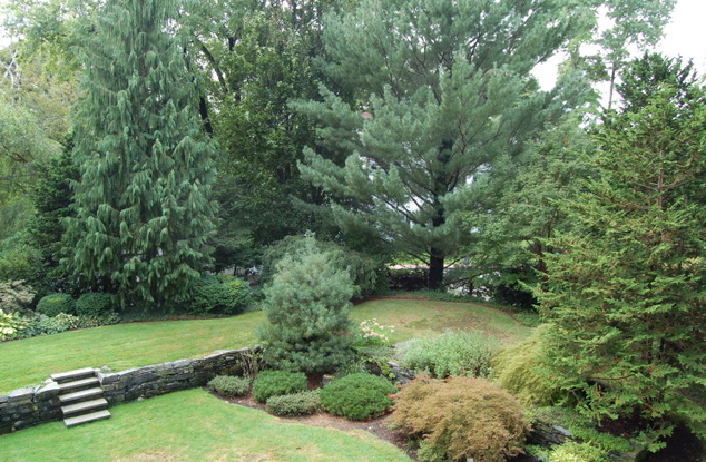
Generally I think of winter as stark and colorless. Yet in February before the snowfall I took a walk through Lincoln. The vistas were teaming with evidence of life and I was fascinated by the textures. Long ago pastures, now secluded, seem primordial.


The day was dreary, cold & overcast. Nevertheless I was surprised by all the life found in winter landscape and delighted in the parched bark, frozen leaves and bubble textures. See for yourself!


It was a day when the ordinary became extraordinary. As I was leaving the sun broke through revealing a lush pathway of green lichen. On my way out I marveled at an aged tree, majestic in its barren state. I can’t wait to see it come to life with leaves in the spring.
Meanwhile I’ll dream of woven fabrics that resemble the patterns found that winter day…

Cambridge’s First International Style Home
I am gratified that 2017 has started with an exciting project which has come full circle on Reservoir Hill, Cambridge. This caps off the last five years of Cambridge “firsts” for Heidi Pribell Interiors.
An Early Innovative Style
One thing leads to another, and our past few Cambridge properties adhere to this idiom. With a current gut renovation of 28 Fayerweather Street, I am mindful of the path clients take to my studio. I am thinking back to 2012 when I re-furnished Cambridge’s first International Style home at 45 Fayerweather Street, The Garrett Birkhoff Home, the only Cambridge work by Walter Gropius’ Harvard colleague, Walter Bogner.

Sunken Outdoor Garden’s defining feature is the foundation wall of the previous Victorian home.
Harvard Faculty
After construction of the Garrett Birkhoff House, Professor Bogner turned his attention to his own home, adjoining Walter Gropius’ home in Lincoln, MA. I would have loved to have met these greats, working in the early 40s, on projects that defied convention. It’s gratifying that Heidi Pribell Interiors was able leave a furnishings mark on Bogner’s only Cambridge landmark.
The exterior gardens were magnificent, but the home inside was euphemistically stale. According to Brattle Associates Real Estate after I staged it for sale, clients viewing the property would exclaim “Wow — who lives here?! This place is fascinating!” In fact the Historical Commission also commented that I “understood the vocabulary of the architecture and selected excellent furnishings.”

Next Historic Home
Next my attention will turn to the first Colonial Revival home in America! Also on Fayerweather Street in Cambridge, I return to this landmark property, having re-furnished the home in 2012, for the family of Governor William Weld. The property had languished on the market for 2 years, and our Heidi Pribell Interiors staging led to a successful sale two months after we completed the project. The Arthur Astor Carey home now has new owners who are committed to a full gut restoration, where my interior design journey on Reservoir Hill continues.


Design Decisions- Parting with Objects
May this posting be of inspiration to all of those who struggle with making tough decisions about what should stay and what should go. In preparing to relocate my studio, I made the decision to take a close look at inventory, and I contacted Skinner, Auctioneers & Appraisers of Antiques and Fine Art, Boston & Marlborough, MA.
I am flattered that Heidi Pribell Interiors for the Home Online represents the launch of a new category of sale Home Design at Auction. http://www.skinnerinc.com/
Once you love a piece of furniture, a painting or a decorative accessory, you are likely to always love something about the piece, but here are a few guidelines that helped me make a decision to cull and create (Skinner please update # per Heidi) -lot capsule collection to be sold at Skinner.
Popular wisdom recommends keeping the stuff that gives us a thrill of joy when touched. Each object I’ve owned has fulfilled a different role in my life. In organizing this sale I decided those treasures without a purpose in my home and/or studio would be set free. As I let go of these assorted furnishings, I do so with gratitude for all of these objects I’ve admired and cherished.
Some decisions are tougher than others, and the following items are included in the collection, but they stand out as fabulous and memorable finds:


- Pair of modern tub & Klismos chairs
- Hepplewhite sideboard with Sheffield silver castors and cabinet knobs
- Modern center table
- Chestnut open pedestal breakfast table
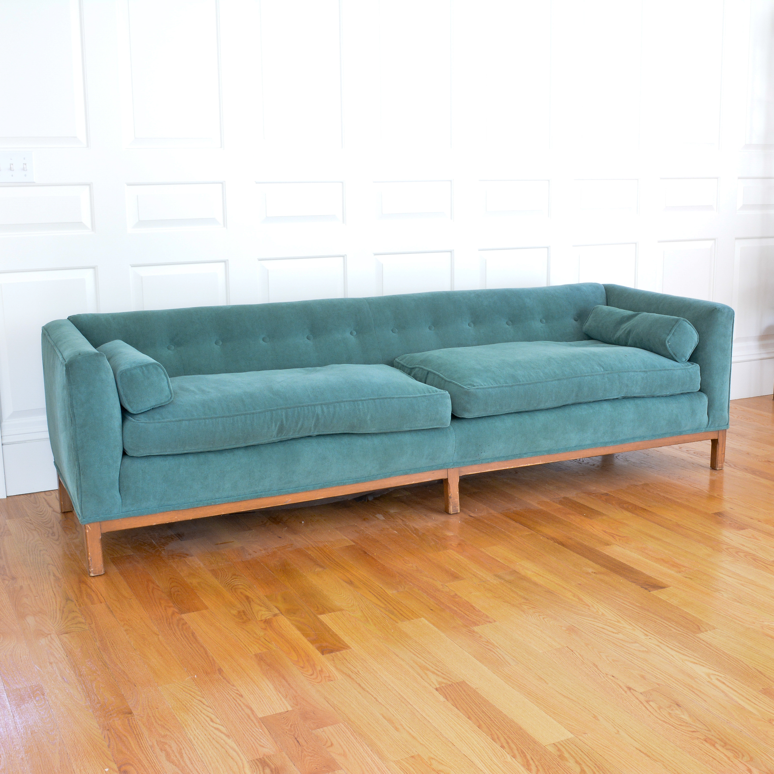
- Dunbar down-upholstered sofa in terrycloth chenille
- Snappy open screen with transparency & glimmer for light and flow
- Fabulous Robin’s egg blue lacquered console tables, a fun change from red or black lacquer
- Oval brass & steel Hollywood Regency oval cocktail table
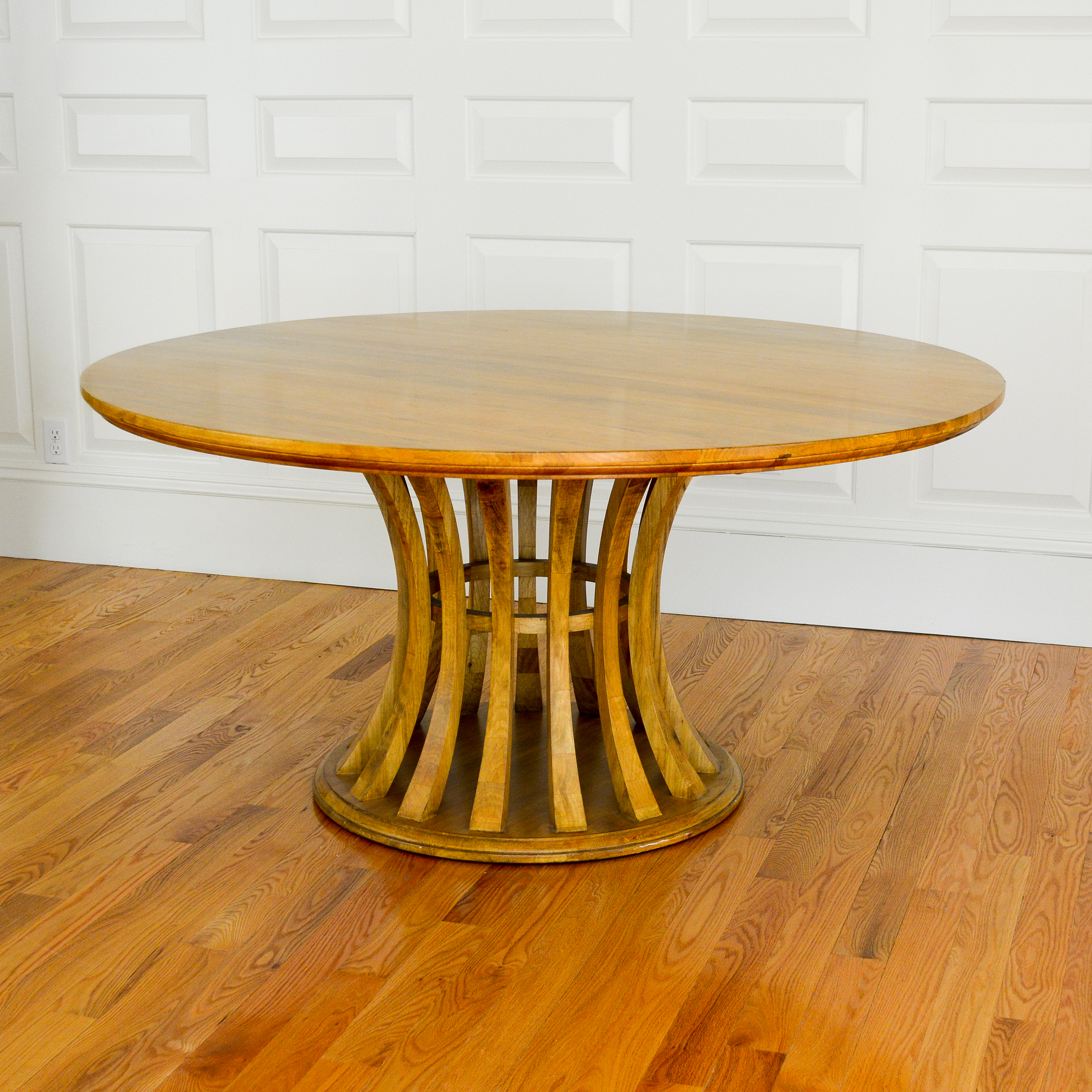
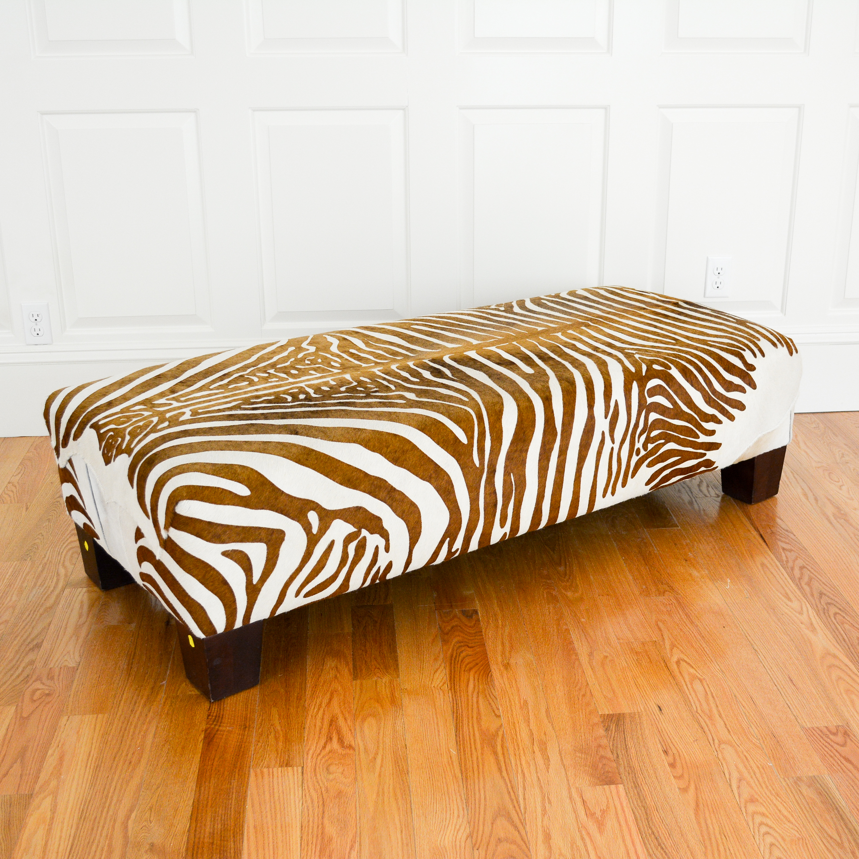
- Large Zebra hide upholstered ottoman
- Leather wrapped & tooled hardwood Carlton desk, retailed by Harrods with interior maker’s plaque
“Old World Ornamentation”
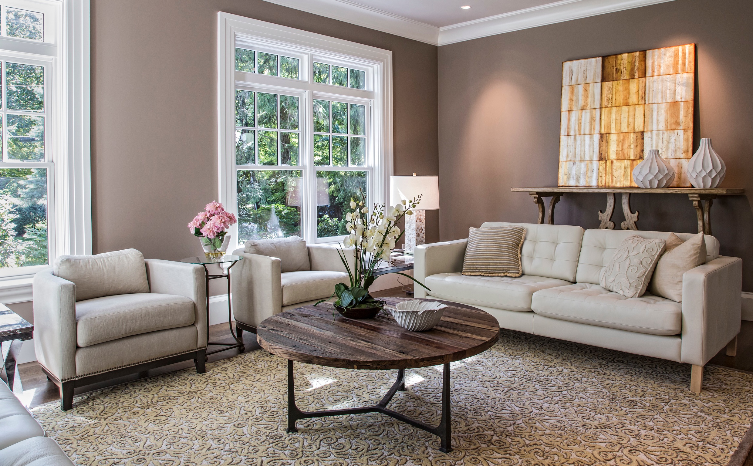
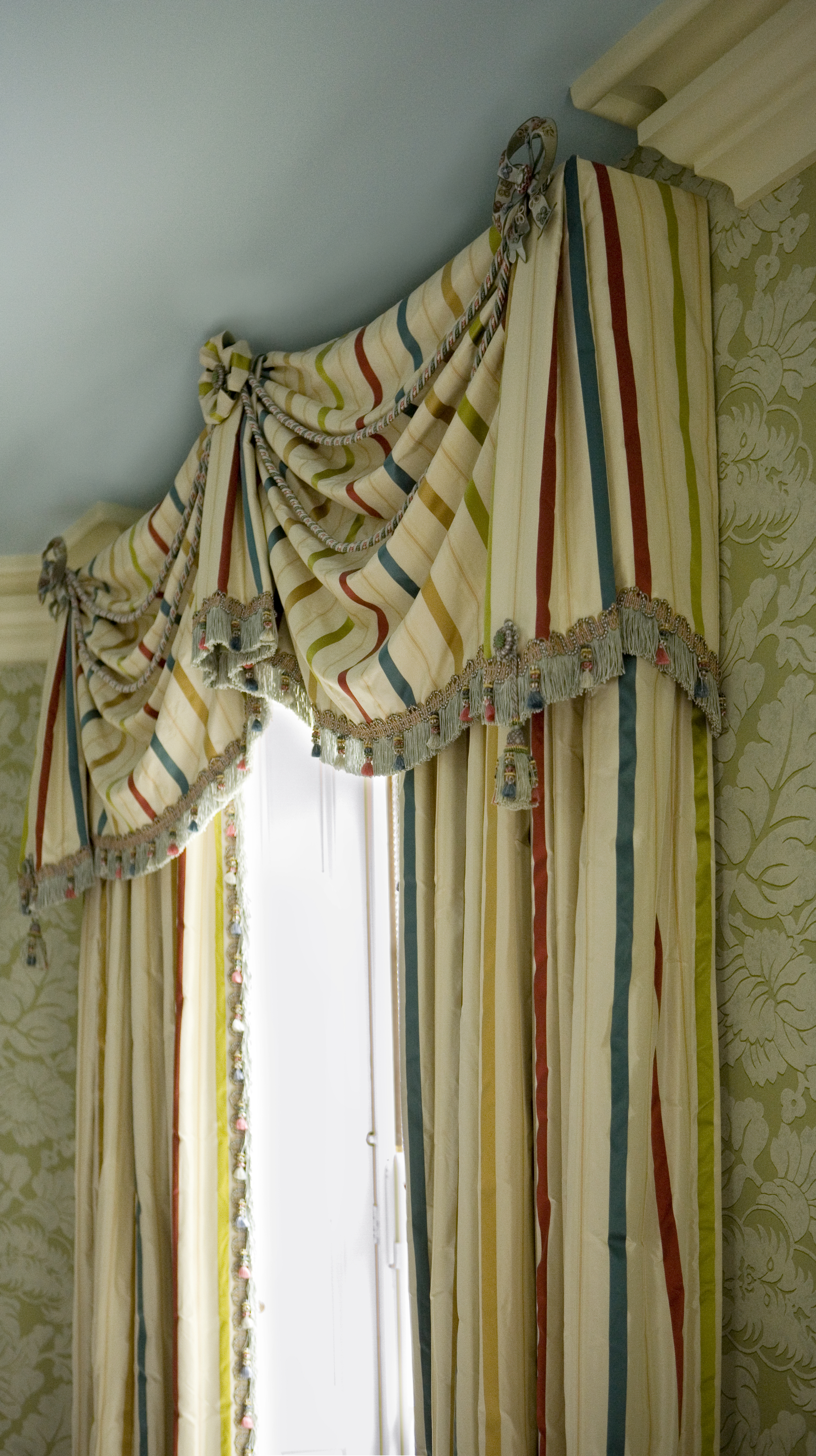
New Trend — Austerity is dull! Last week the Wall Street Journal announced that “fringe, cording and tassels” were one of five new major trends. Yes, old world ornamentation does give character to modern upholstery.
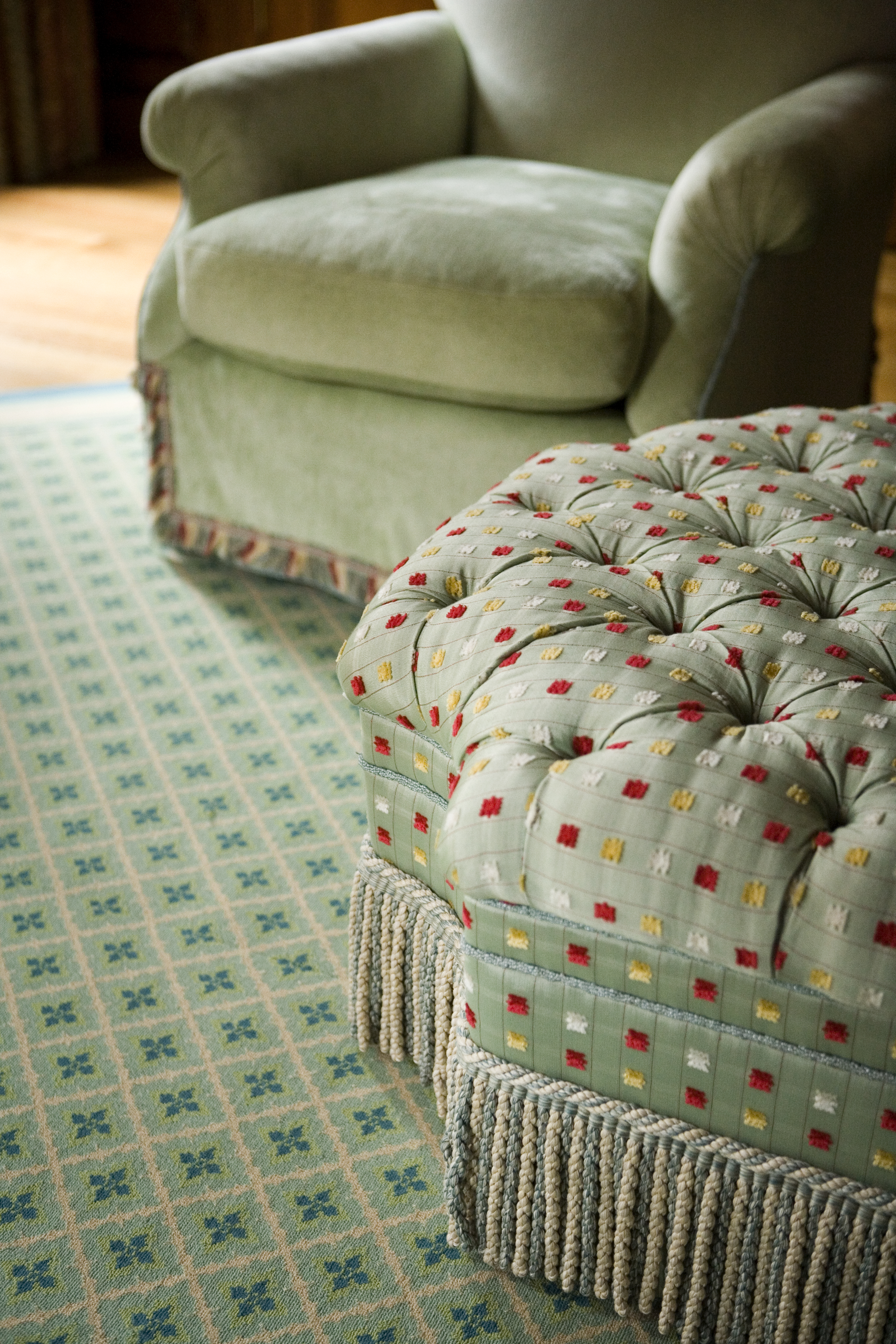
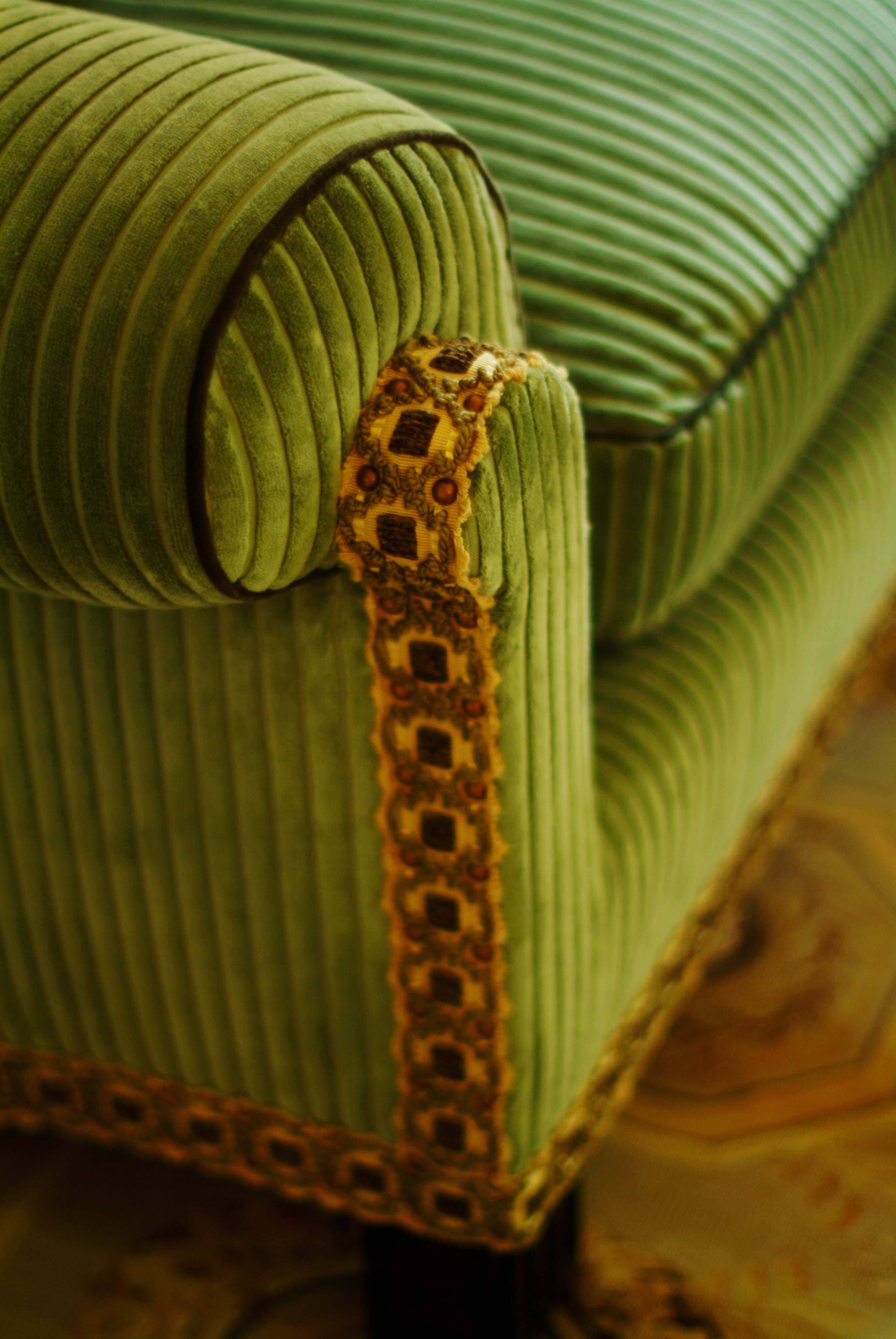
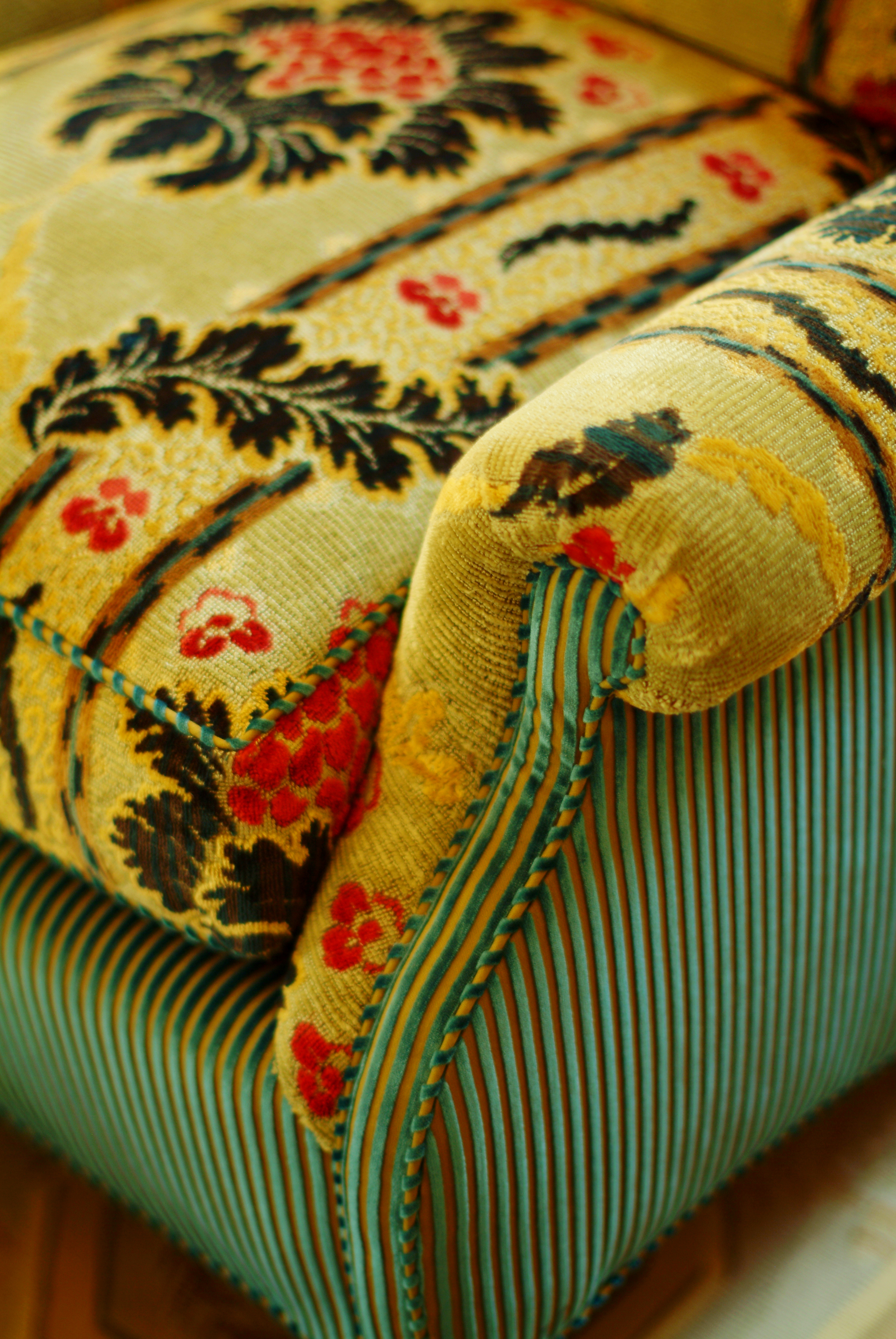
History is not only a source of wisdom, but also comfort in our rapidly changing millennium. Classical Georgian & Empire antiques have unwavering appeal. Fashionable are interiors are now “traditional and dressy, with a shot of nostalgia.” For those of us with any reverence for history, this is reassuring.
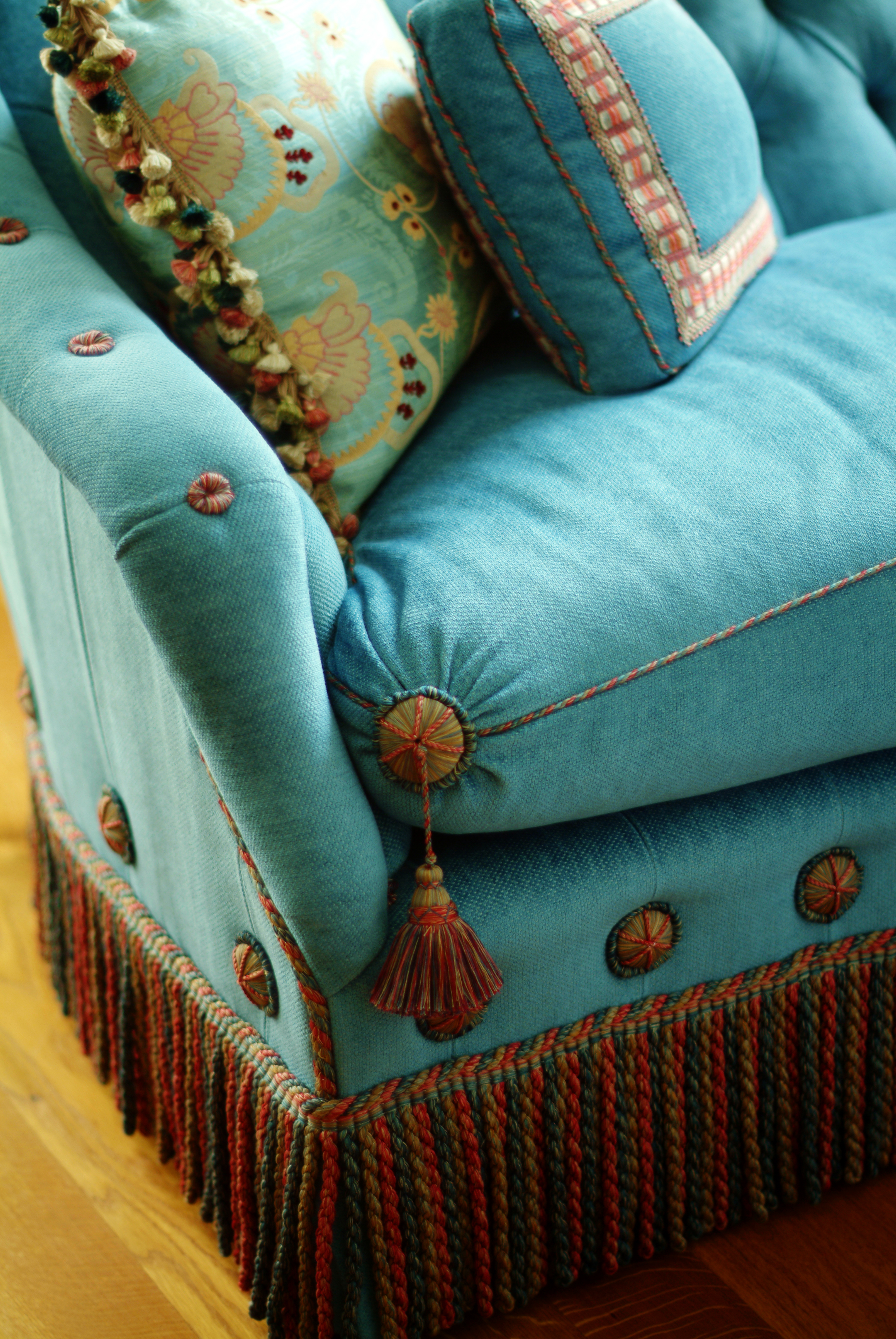
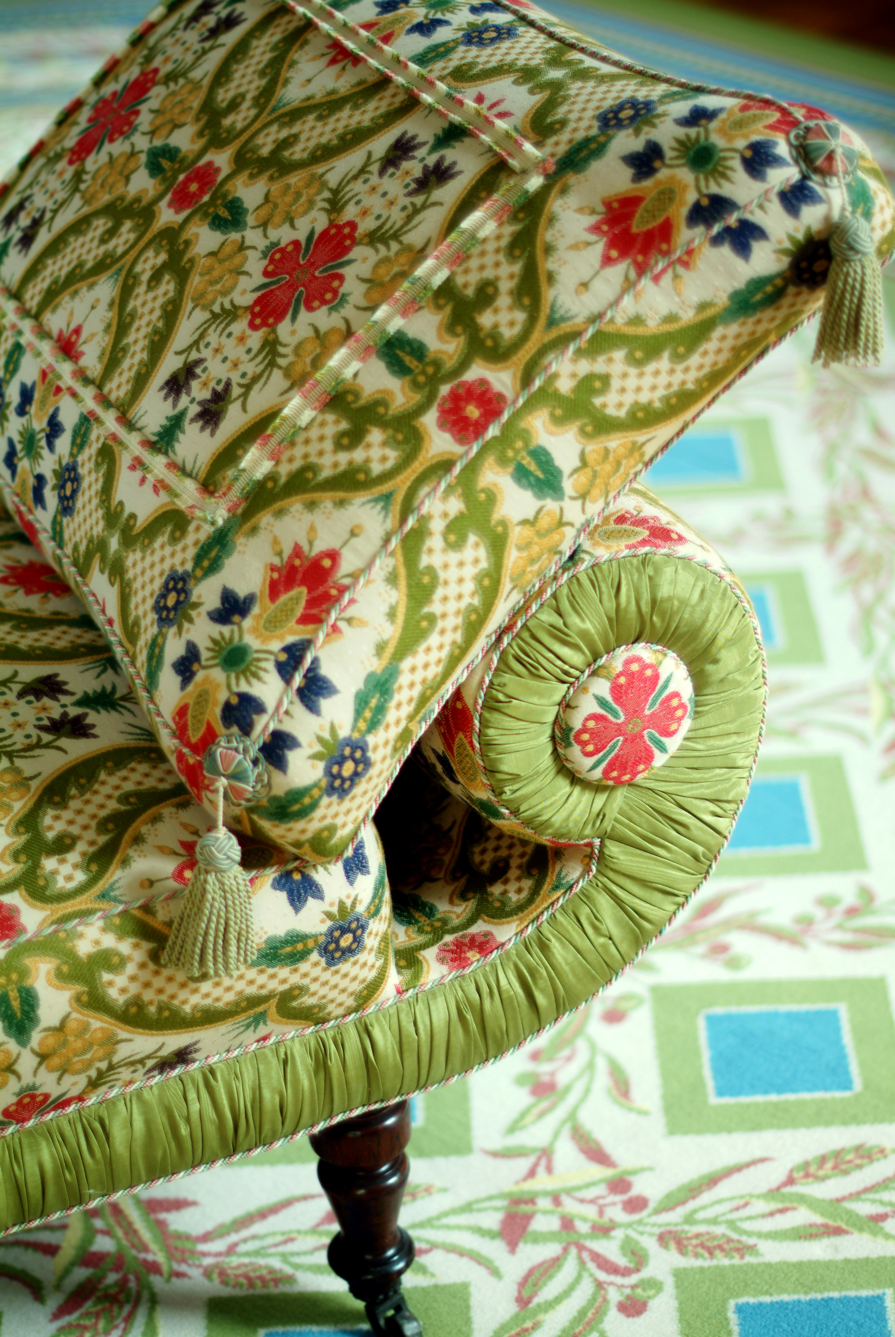
I have always said windows without curtains look like a woman without eyebrows. More “dramatic drapes” are resplendent in our technological age. I hadn’t known passementerie was out-of-style.

Other trends are mid-century Mexican modernism, black metal, rounded corners, and flat-woven rugs from Scandinavia.
See — http://www.wsj.com/articles/top-5-interior-design-trends-for-2016-1451423833
YELLOW!!
“There are painters who transform the sun into a yellow spot, but there are others who, thanks to their art and intelligence, transform a yellow spot into the sun.” Pablo Picasso
 Yellow is universally associated with life-giving sunlight. In addition to being the lightest and brightest, yellow is THE most cheerful on the color spectrum. As one of three primary colors, yellow is linked to joy, warmth, and optimism.
A broad range of yellows exist with hues varying from orange to green. For interior spaces I favor using orange-toned yellows, and reserve use of green-yellows for smaller applications. Dark and dim areas––hallways, basements, windowless rooms––can benefit from an uplifting splash of yellow.
 Although symbolic of happiness, yellow can evoke mixed messages. In it’s purest form, a little goes a long way to highlight emergency vehicles and cautionary signs. It’s surprising yellow doubles as both a helpful reminder and a warning of danger. Perhaps the duality originates from the facts that yellow sulphur, smells putrid and that yellowing plants eventually die. I speculate that the timidity and cowardness associated with “yellow-bellied,” refers to an unhealthy yellow tinted with green, nearly jaundiced.
In Imperial China, yellow was considered the most beautiful and prestigious color, reserved for the emperor’s use. The Chinese saying, Yellow generates Yin and Yang, implies that yellow is the center of everything signifying neutrality and good luck. This may be why new parents often decorate baby nurseries in yellow, rather than more traditional gender-specific pink or blue.
 A client wanted to change the feel of her living room with minimal effort. The burgundy walls
 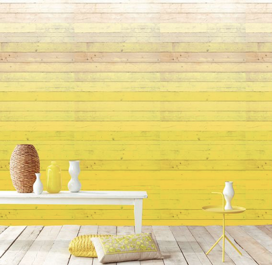 felt antiquated, so that was an easy starting point. I suggested keeping the warmth, but lightening the paint color to a shade of orange or yellow. After experimenting with several test colors, she opted for a cheerful, sunny yellow. The entire energy of the room changed. which freshened the energy against creamy white trim and neutral furniture.The yellow paint accented by the existing white trim created an open, cheerful, and inviting space. Every member of the family prefers the yellow update!
Your World, Made to Order
The Studio at Heidi Pribell Interiors is expanding conventions by creating personalized wallpapers.
In keeping with the unique thread that runs through everything we do, our bespoke wallpaper continues to be a natural progression as we provide custom papers and murals in the form of original, evocative backdrops.
For individuals seeking something personally gratifying, collaborate with us on custom themed designs. A concept can pertain to nature, children, pets, textures, vintage memories, travel or other pursuits.
Muse on what is near, dear or inspiring to you. Re-think your keepsakes and contact us!
Orange is the New Red

Scalamandre
Growing up surrounded by a grove of oranges trees, I adore the vibrant color of my childhood. Orange never fails to inspire me!
Stimulating and flamboyant, orange is associated with energy, warmth, and sensuality. It stimulates hunger, creative energy, and desire, which brightens and boosts its surroundings. This warm hue invokes images of summer heat and autumn harvest.
I recommend using it in areas for extra joy or warmth. Restaurants often use orange to encourage feelings of hunger, sociability, and comfort.

Canovas
Frank Sinatra once said, “Orange is the happiest color,” and I’m inclined to agree. Apparently more than any other color, orange invokes extreme positive and negative reactions. People tend to love it or hate it, but few feel neutral. Orange may be controversial, but it certainly isn’t boring!
I’m partial to orange, and surround myself with many shades of it––salmon, pumpkin, terracotta, coral, melon, persimmon––and embrace using it with pink!


While I use orange liberally, sometimes the suggestion meets resistance. Once when I advised a client to use an apricot hue to warm her living room, she revealed that oranges make her uncomfortable. Later she took a leap of faith after hearing my delight in finding pleasant ways to incorporate unlikely color, and agreed to paint a basement stairway a basketball color. Now the bright, lively kitchen joyfully transitions to the somewhat neglected basement. This simple but significant enhancement surprised the client, and she now enjoys the trek.

TIP: If you love feeling inspired, stimulated, and happy, surround yourself with orange. Or, like my client, use it subtly because there’s always somewhere to enjoy orange!
The Power of Red
 I love red! Essentially it’s symbol of life’s vitality and represents our heart, likely because it is the color of blood. Yet there are people who shy away from the color perhaps because of fear that it represents anger, warning or death.
I associate red with the basic things we need for survival and security––those things that give life! But also red represents power and prestige. We roll out the “red carpet” for VIPs.

I recently attended an event at the Harvard Art Museums dedicated entirely to the color red. The speaker, art historian and research curator Francesca Bewen, pointed out many popular perceptions (and perhaps misconceptions) of this primary color: caution, danger, halting (stop signs worldwide are red), errors (I still remember my teacher’s red ‘X’ marks next to wrong test answers).
She also addressed the fugitive nature of red and how it is one the most outstanding characteristics of all red pigments. This is a characteristic of many Mark Rothko murals famously commissioned by Harvard in the 1960s, which have since faded due to this phenomenon.


To exhibit the murals as the artist originally intended them to appear, the museum incorporated sophisticated light technology to counterbalance their current faded character.
It’s curious that like a burst of energy, the bold nature of red pigments historically dulls with time. Iron oxide reds are generally dull, and although red lead is bright, it blackens with age. The organic dyes derived from wood and insects tend to be more transparent, and are also fugitive. For the purpose of using a bright red, vermillion was used in combination with red lead. For interior use, historically such intense colors were reserved for small discreet elements because of the expense.
Although I crave all shades of color, red is one of my favorites. It represents energy, love, and passion, and it brightens any room, even when used in small ways. For example, this red trim against white walls infuses the room with warmth, character, and a little more love.

When I think of iconic red rooms, it’s always Diane Vreeland’s apartment that comes to mind.

Bear in mind red plays a significant role around the globe. It symbolizes good luck across Asia and is held in such high esteem that the majority of the world’s flags (about 77 percent) incorporate red into their design.
 Tip: If you want more love, energy, and passion in your life, add a little red. Open your mind to the possibilities it has to offer. Red is full of potential!
Out With the Old, In With the Joyful
 When it comes to home (and office) decorating and organizing decisions, what goes is as essential as what stays. Discarding can involve some difficult choices, stress, even emotional resistance. But giving, donating, recycling, and throwing away are integral to transforming your space.
Everyone has their own system for discarding, tidying, and organizing––and some work better than others.
To help with my latest spring cleaning session, I sought help from some experts. One source of inspiration was Marie Kondo’s New York Times bestselling book “The Life-Changing Magic of Tidying Up.”
The 30-year-old Japanese author works full time as a professional tidier who employes her own eponymous “KonMari” method with her clients. If followed correctly, Kondo claims, the method prevents the need for any future organizing. Kondo offers a one-tidy-up-stop over the course of six months. Apparently, she a three-month waiting list of new clients.
Some of her instructions are common sense, but others provide unconventional food for thought. For example, she advises organizing by category instead of room, as well as clearing out all unwanted items before tidying. The KonMari bottom line: surround yourself with items that bring joy to your life, and discard the rest. Focus on love, positivity, and fulfillment, and release anything because it is an energy drain.
On the other hand, Dominique Browning––senior director of Moms Clean Air Force and blogger for SlowLoveLife.com––wrote a New York Times article titled “Let’s Celebrate the Art of Clutter.” She takes a different approach in the clutter debate but offers a similar takeaway. Browning argues for the value of accumulating clutter, but also underscores the important role of love in the process.
She writes, “It is time to celebrate the gentle art of clutter. We live, and we pick up things along the way: the detritus of adventure; the vessels of mealtimes; the books and music of a life of the mind; the pleasures of our daily romps through the senses.”
 Browning not only celebrates the accumulation of things while alive, but she takes the art of clutter one step further and insists that her children adopt it all after she has died. These material things, she claims, are infused with a lifetime of meaning, even for the next generation.
One of these philosophies may resonate with you more than the other. Most likely fall somewhere in the middle, between the two. Whatever your approach is, consider your material possessions and think about how they make you feel when cleaning, tidying, organizing, decorating. The answers may surprise (and even delight) you.
Tip: Find organizing techniques that resonate with you. Prioritize items that elicit feelings of love and joy even more than thoughts of function and practicality.
Need a Change? Start With Paint
Painting is a straight forward way to change your environment, because color makes a huge emotional difference. So when updating a space, making over a room, and refreshing the energy of a home or office, painting is an effective approach without committing a large investment.
 A new color combination can always improve a tired space. And if the overall effect is not quite satisfying, it’s just as easy to remedy with a coat of another paint color.
If you are choosing between several colors, I suggest painting them each on large format boards. Because they can be mounted around the room, each color may be viewed in differing light. This is an effective way to choose color before painting the entire room.
Experimenting with bold color is easy with color boards simply because the investment of time & money is relatively small. And the payoff could be great!
Splashes of color help make New England winters more pleasant! This lively red trim turned a lackluster space into a vibrant, cheerful family room.

And a little color transformed this formerly nondescript, white-walled space into a spirited children’s bedroom. This mellow green paint accented with a vivid yellow wallpaper brightens and infuses the room’s youthful energy.

I first defer to my clients’ preferences, because I can make any color scheme work. Choose colors you enjoy, but don’t be afraid to mix it up and try something new!
Bear in mind that even a simple adjustment to a neutral shade can have outstanding results.
Tip: Painting just one wall can change the feel of a space, and it’s easy to do on a budget. Take a color plunge and have fun!
India Hicks in Boston
 When I RSVP’d to the 2015 Spring Showcase at the Boston Design Center featuring designer India Hicks, words like ‘sophisticated’ and ‘privileged’ came to mind.
My short list of expectations, however, did not include ‘down-to-earth’ or ‘self-deprecating,’ although India was both while presenting her hour-long slide show. With humor and poignant anecdotes, she shared images and stories of her business, background, family, and Bahamian home on Harbor Island.

Similarities don’t readily come to mind when one looks at her list of titles:
- Former Ralph Lauren and J. Crew model
- Daughter of American designer David Hicks and British aristocrat Lady Pamela Mountbatten
-687th in line for the British throne, - Goddaughter and second cousin of Prince Charles of Wales (and a bridesmaid in his wedding to Lady Diana Spencer)
But it’s hard to disagree with her homegrown maxims like “never negotiate with a cocktail in hand,” and “mother nature gives us so many ideas to steal.”

India admitted to an atypical childhood, a spoiled upbringing, and aversion to domesticity – she said more than once, “I don’t cook, but I do direct.”
Then came other sprinkles of humility like this one––the design book her father dedicated to her, the youngest of the Hicks children, was the one about bathrooms.
She spoke highly of her 85-year-old mother, but balanced the praise with confessions that the family matriarch never cooked or washed her own hair.
Despite the lifestyle gap between herself and most of her audience members, India strove to find common ground:
- Work and family balance
- Preparing a party for more guests than expected
- Maintaining peace in a modern world
- Pursuing your own passions, especially for women
India tried to persuade her audience that they all shared more qualities with her and each other than they may realize, a point she reiterates in her blog (which is really more like a personal diary).
Her parting words? “We’re all feeling the same.”
Tip: Check your expectations at the door. You may be pleasantly surprised by the result.